What is colour rendering?
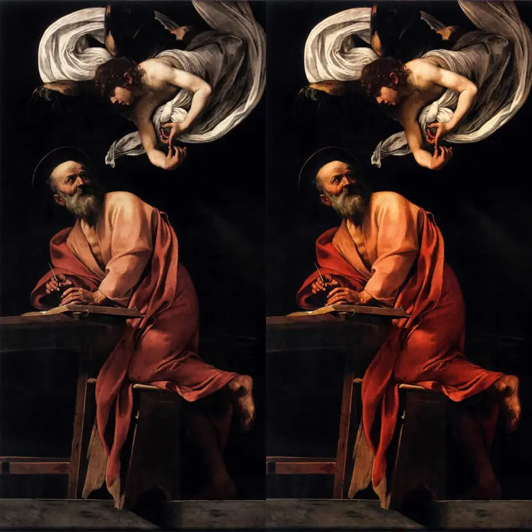
Colour rendering refers to a light source’s ability to reproduce the colours of objects naturally and accurately.
In other words, it does not describe the colour of the light emitted, but rather the way in which that light allows us to see what it illuminates.
To assess this, the CRI or Ra index is used, expressed on a scale up to 100. The higher the value, the more closely colours are rendered to their true appearance.
A value above 80 is suitable for many professional applications. However, when it is particularly important to correctly identify materials, surfaces or shades, it may be necessary to choose light sources with values above 90.
Colour rendering should not be confused with colour temperature. Both warm and neutral light can have high colour rendering. The former defines the atmosphere of the space, whilst the latter determines the quality with which we perceive colours.
For this reason, when choosing a light fitting, it is not enough to consider only how much light is produced. It is also necessary to assess how that light interacts with the objects and surfaces in the space.
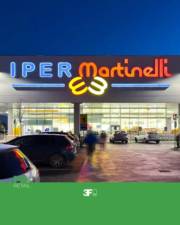
A real-world example: Martinelli Hypermarket
Colour rendering plays a particularly important role in large-scale retail environments, where light directly contributes to the perception of freshness, quality and appeal of the products.
Fruit, vegetables, meat, fish, bread and delicatessen products have very different colours, surfaces and characteristics. Inappropriate lighting can make food appear less natural or less appetising. A properly designed solution, on the other hand, enhances these products without altering their appearance.
In the project carried out for the Martinelli Hypermarket, the lighting in the departments was specifically designed to make the shopping experience clearer and more enjoyable.
3F Linux luminaires were used, featuring LED light sources with high colour rendering and different colour temperatures, selected according to the various display areas.
The lighting was therefore adapted to the characteristics of the products: not a one-size-fits-all solution for the entire store, but a design capable of meeting the specific needs of each department.
The light distributions were also chosen based on the positioning of the luminaires and the layout of the display areas. In this way, the light is directed where it is needed, showcasing the products whilst minimising light spill and unnecessary contrasts.
The result demonstrates that colour rendering does not depend solely on the stated value of the light source. To achieve a natural and consistent perception, it is necessary to ensure that light quality, colour temperature, optics and luminaire positioning all work together.
The Martinelli Hypermarket project therefore represents a concrete example of how proper lighting design can transform the way products are viewed and perceived.
Discover the Martinelli Hypermarket case study and find out more about the lighting solutions adopted to showcase the various departments of the store.
Seeing better means designing better
Colour rendering is a technical parameter, but its effects are immediately perceptible to everyone.
High-quality light enables us to recognise colours accurately, discern materials more clearly and experience spaces in a more natural way. This is why its assessment should always begin with the application, the objects to be illuminated and the visual experience one wishes to create.
Because lighting a space does not simply mean making it visible, but accurately rendering the reality it contains.